http://www.deesign-4-life.blogspot.com/
Monday, February 9, 2009
Sunday, February 8, 2009
The Intech wall
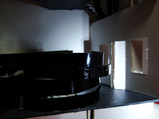
 this is the featured wall i did for my casestudy. Its actually a semicircle wall-ceiling, but i cropped out a portion for my featured wall. its half of it.
 one scale 1:5,
 the other scaled wrongly.


This will be the place where the wall will be placed. the studio.


This will be the place where the wall will be placed. the studio.


it is connected using angled plates. as shown below .

It suits my shphse design is because, its curve and the strips behind.


It suits my shphse design is because, its curve and the strips behind.

Moodbox-Shophouse processes
From the beginning! Choosing of our clients! Claude Monet was my client. He's an artist, an impresssionist! 


from the back elevation...

closer look.

Coming into the house, will be the gallery, where monet would hang his paintings in a semi circle manner. this would make his works look completed, as his paintings usually comes in a series...
 Moving in, will be the dining area, which is the most impt space in the hse, with the height of 3storey. Guests could dine tgt and read the paintings at the same time.

the overall view... there is 3 storey in the house.


the 3rd storey consist of the studio and at the other end there is a personal space for monet to rest, the resting area!
studio


resting space

How do monet goes up? by using the stairs... the one on the right goes up to monet's studio, and the left going up to the rest area.

At the 2nd storey, there is only the sleeping space and a toilet attached to it. It's a rather private space for monet, as he does not like to be disturbed when he is resting in his room. thus the entrance to the room is small and frm afar, it look enclosed up.

from the room, monet can see the gallery very clearly, he is able to see who is visiting him, and decide who to meet or not.

looking up from lvl 1!
by using the stairs at the garden area, monet can get upthe the 2nd storey. Beside the garden, is the cooking area...


next, we proceed to our moodboxes. Where we had to make a box that is related to our client's characteristic!
Monet uses strokes in his paintings, thus, i used strips to represent the strokes.
 Strips interlocking each other. Just like the strokes overlapping.

 Green being the base color and orange flows around in several strips connected to make it seems continuous.
The drawing below is different views of the moodbox. Black line represent the orange strips.


This was my 1st attempt of the moodbox. i used crepe paper, due to its luminous. when light passes through, the color of the light change to the color of the crepe paper.

 However crepe paper is filmsy and creates random curves. so i dropped the idea of using it.
 Strips interlocking each other. Just like the strokes overlapping.Green being the base color and orange flows around in several strips connected to make it seems continuous.
The drawing below is different views of the moodbox. Black line represent the orange strips.

This was my 1st attempt of the moodbox. i used crepe paper, due to its luminous. when light passes through, the color of the light change to the color of the crepe paper.


 However crepe paper is filmsy and creates random curves. so i dropped the idea of using it.
Then, the end product of the shophse!
keep in suspense...

the interior frm the front elevation...

from the back elevation...

closer look.

Coming into the house, will be the gallery, where monet would hang his paintings in a semi circle manner. this would make his works look completed, as his paintings usually comes in a series...
 Moving in, will be the dining area, which is the most impt space in the hse, with the height of 3storey. Guests could dine tgt and read the paintings at the same time.

the overall view... there is 3 storey in the house.

the 3rd storey consist of the studio and at the other end there is a personal space for monet to rest, the resting area!
studio

resting space

How do monet goes up? by using the stairs... the one on the right goes up to monet's studio, and the left going up to the rest area.

At the 2nd storey, there is only the sleeping space and a toilet attached to it. It's a rather private space for monet, as he does not like to be disturbed when he is resting in his room. thus the entrance to the room is small and frm afar, it look enclosed up.
from the room, monet can see the gallery very clearly, he is able to see who is visiting him, and decide who to meet or not.

looking up from lvl 1!

by using the stairs at the garden area, monet can get upthe the 2nd storey. Beside the garden, is the cooking area...
Before the end product succeeded! there is alot of mistakes made...

comments received for the 2nd attempt of the mockup house: too messy

This is the final mockup,spaces more defined.
 established a common language, interlocking of strips,
 & curvy lines.

Trying to use the strips to form the walls and floor, but it ended up like a nest.

comments received for the 2nd attempt of the mockup house: too messy

This is the final mockup,
 established a common language, interlocking of strips,
 & curvy lines.
This is the 3rd attempt...
knowing where is the spaces and its uses after drawing a mindmap.


the 4th try,
making the spaces more like a space... that is different from each other.


Subscribe to:
Posts (Atom)


